The Brief
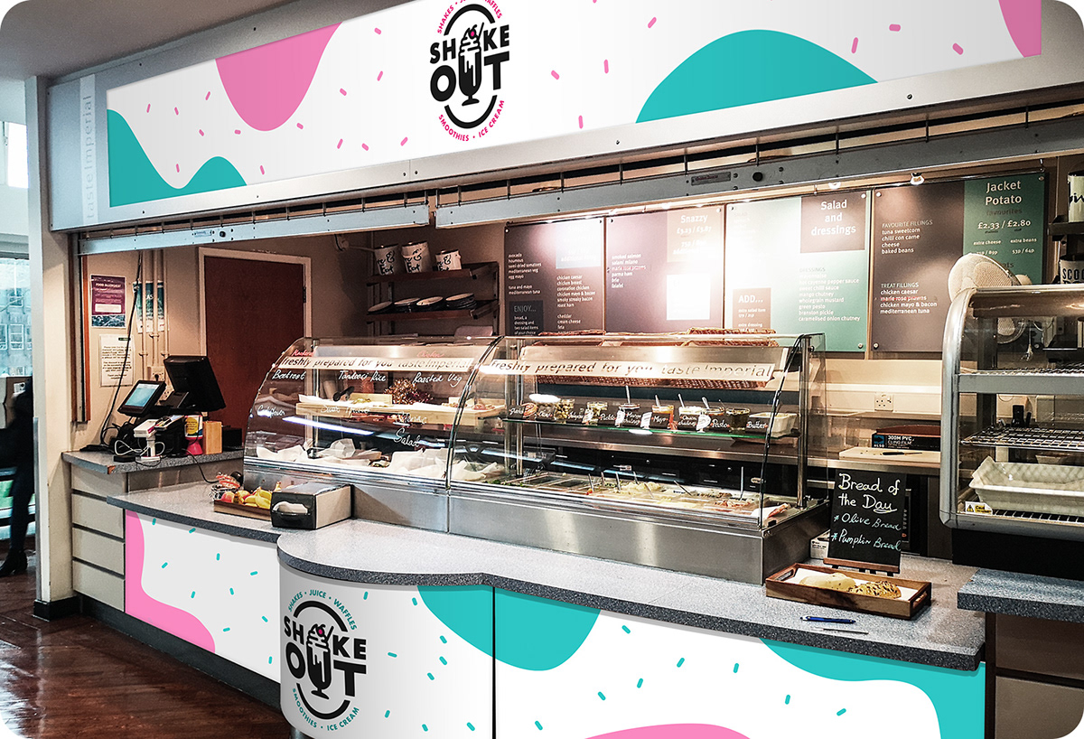
The in-house catering team at Imperial College London contacted me to help them build a new brand. As part of their summer programme of refreshing their outlets, the team were preparing to launch their first smoothie/shake bar ‘Shake Out’ for the new academic year. The offering would be centred on smoothies, juices and milkshakes, as well as sweet treats and would be situated in the Junior Common Room, a food court area that is already home to a number of other outlets.
The in-house catering team at Imperial College London contacted me to help them build a new brand. As part of their summer programme of refreshing their outlets, the team were preparing to launch their first smoothie/shake bar ‘Shake Out’ for the new academic year. The offering would be centred on smoothies, juices and milkshakes, as well as sweet treats and would be situated in the Junior Common Room, a food court area that is already home to a number of other outlets.
The Solution
I came up with a concept that uses a milkshake glass to form the letter ‘U’ in the word ‘OUT’, and the whipped cream on top to form the letter ‘A’ in ‘SHAKE’.
I came up with a concept that uses a milkshake glass to form the letter ‘U’ in the word ‘OUT’, and the whipped cream on top to form the letter ‘A’ in ‘SHAKE’.
I arrived at this design (or a variation of it) quite quickly, but refining it took a lot of effort. I originally had the two elements (the glass and cream) separated, but after I joined them, and used some ‘drips’ from the milkshake to form the negative space in the U, the logo fell into place.
The design is balanced well, it reads clearly, and transitions superbly across multiple formats. Removing the surrounding elements (the circular border and wording) on smaller formats, allows for multiple scalable variations of the logo.
Thanks to a great briefing process from the team at Imperial College London, this was the first and only concept I presented, which needed absolutely no amends! We then developed a set of brand guidelines together to make sure there will be no misuse of their wonderful, quirky new logo.
Full project: barnard.co/work#/shake-out/